Pop Art
A pre-event microsite designed for the conceptual client, Textil Museum Tilburg. Our team sought to create an online presence for our client by exploring design precedents and principles, guiding our team toward decisions that achieve a meaningful user experience that resonated with our target audience and established our client’s identity.
Click here to test it out!
Our team was given the designer Wolfgang Weingart, in order to establish the foundation for our design direction. After selecting the event, Pop Art Fabrics and Fashion, it became crucial to avoid cliché approaches. This led to a key development of discovering ways to turn pop art contemporary, while still maintaining distinctive features that made it unique.

Understanding
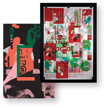
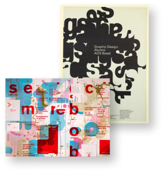
As we explored Weingart's design precedents, a clear quality began to surface that could be observed in his montage works. He primarily made the use of transperancy in order to facilitate the layering process that was so prevalent in his works. This, along with carefully placed geometric elements added greater visual depth as well as accentuated different visual hotspots to which the viewers eyes were guided.
Research
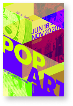
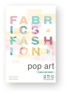
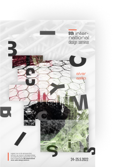
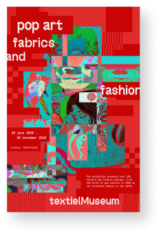

Through the line of investigation, breaking the parameters of geometric shapes, surfaced translatable elements for the microsite. Intending to bring the event to the user before the user went to the event, the qualities discovered provided an initial framework for the placement of elements while the principle guided the framing of content for interactions. This built a balance between the being as expressionist as possible whilst maintaining functionality by conveying information efficiently.
Review
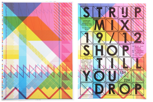
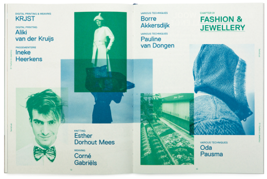
Dunbar Tall's extended but condensed letterforms, brings a retro sophistication adding a classic touch- while Montserrat's simplicity and versatility, expressed through its short descenders and wide apertures, supports contemporary needs. This pairing blends elements of classic and current works within the composition and maintains a sense of coherence and harmony.

Font
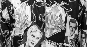
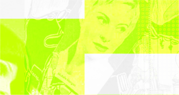
Applying monotone allows them to blend into the composition without being visually busy and reinforces the idea of revitalising the old with the new, the core theme of our design direction. The brightness brought by neon monochromatic palettes stimulate varying levels of alertness to engage and lead users through the content of the microsite. The important usage of colour became one of the foundational aspects of the user experience, due to the usage of expressionism that would have, at times, inadvertently confused users.
Colour
The heuristics we employed in our design allowed the user to intuitively engage with the site and discover its content effortlessly. The gestalt law of common regions allowed for users to quickly pick up on commonalities to learn quickly how to navigate the microsite efficiently. The particular expressionism employed in the microsite had the unintended effect of additionally making any usability issues less noticeable, or appear intentional.


Prototype
Reflections
This project was one of the most influential in my journey for developing a competency for user experience design by way of reinforcing all that I had learned throughout my undergraduate career in UI/ UX design. I learned aspects of visual design from an atomic level onwards through fonts in their spacing, structures and how the complement each other- moving onto grids and how they act as invisible leylines in structuring elements on a page. The process of exploring design ideas through designing initial posters, brainstorming and analysing font-pairings and experimenting with ways a historic design precedent such as pop-art could be transferred to fit a more modern context. Much of my understandings of the importance of grid structures, copywriting and colour usage, was also gained from this, allowing me to better develop and design different visual identities unique to each client I may encounter in the future.